Exploring the Progression and Interpreting the Double S Signature
The double S symbol, often referred to as the "ss ligature" or the "Eszett" in German typography, holds a significant place in the world of graphic design and linguistics. This intriguing symbol, most notably seen in the German letter ß (Eszett), has undergone transformations and adaptations throughout history, maintaining its relevance in modern typography.
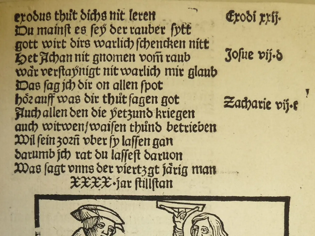
The double S symbol was first introduced in the Middle Ages to simplify writing and printing, particularly in Germanic languages. Initially, the "ss" sound was written as two separate letters "s." However, the double S symbol, which resembles a lowercase "f," was created to make the writing process more efficient and improve the flow of written content.
Over the centuries, the double S symbol has undergone evolution and adaptation to changing typographic practices. It has been used in Latin and Romance languages, where ligatures combining two "s" letters were common. The symbol has also undergone various transformations and adaptations, reflecting the evolution of typography and the need for clarity and efficiency in written communication.
In German, the double S symbol functions as the voiceless alveolar fricative "ss," distinct from its historical usage in English. It is an essential part of German orthography, helping to maintain spelling distinctions in German-speaking countries. The uppercase form (ẞ) was added to Unicode and official usage in recent years, reflecting its ongoing relevance.
Separately, a symbol that looks like two intertwined S's is the section symbol (§), which is distinct from the ligature but sometimes informally referred to as "double S." This symbol is commonly used in legal, academic, and formal documents to mark sections or subdivisions within texts, enhancing readability and organization. It is widely employed in legal documents, contracts, and references to help locate specific sections efficiently.
In typography and design, the double S ligature itself remains relevant in the design of German texts and typefaces that support German orthography. Many modern fonts, including condensed, narrow, or stylistic serif and sans-serif fonts, may include stylized ligatures like ß to preserve typographic tradition and clarity in German text. The section symbol (§) is often incorporated into graphic design and user interfaces where legal references or document navigation is required, helping to communicate structure visually.
To summarize, the "double S symbol" in typography can refer either to the Eszett (ß) ligature vital in German text or the section symbol (§) used in document structuring and legal contexts. Both maintain cultural and functional significance in modern typography and design. Despite its decline in everyday English usage, the double S symbol, or the Eszett, still finds its place in certain contexts, such as historical documents and graphic design, where a sense of nostalgia or historical authenticity is desired.
References:
[1] Section Symbol (§) - Wikipedia. (n.d.). Retrieved February 2, 2023, from https://en.wikipedia.org/wiki/Section_symbol
[2] Eszett - Wikipedia. (n.d.). Retrieved February 2, 2023, from https://en.wikipedia.org/wiki/Eszett
[3] Fonts - Adobe Fonts. (n.d.). Retrieved February 2, 2023, from https://fonts.adobe.com/
[4] History of the Double S Symbol. (n.d.). Retrieved February 2, 2023, from https://www.myfonts.com/blog/fontology/history-of-the-double-s-symbol/
[5] The Section Symbol (§). (n.d.). Retrieved February 2, 2023, from https://www.myfonts.com/blog/fontology/the-section-symbol-%C2%A7/
- The double S symbol, while often seen in German typography, can also be found in other realms, such as fashion-and-beauty and lifestyle, where designers might incorporate stylized fonts to create unique, culturally significant designs.
- In the world of food-and-drink, a double S symbol resembling a section symbol (§) is commonly used by chefs and restaurateurs to denote specific dishes or sections on the menu, resulting in an organized and visually appealing presentation for customers.
- When it comes to home-and-garden, passionate DIY enthusiasts may find themselves using the double S symbol (ß) in unique ways, such as incorporating it into custom-made signs or hand-painted typography, reflecting a creative mix of tradition and modernity within their personal spaces.
- Lastly, traveling the world can provide opportunities to encounter the double S symbol in various contexts, from shopping signs in quaint European towns to historical monuments that preserve the intricacies of ancient fonts and typography, offering a glimpse into the rich history of this unique symbol.


